
Notice
Recent Posts
Recent Comments
Link
티끌모아 태산
Flex 핵심정리 #8 - 개별 아이템 속성 본문
이 게시글은 [CSS Flex와 Grid 제대로 익히기]의 강의를 보며 정리한 내용입니다.
CSS Flex와 Grid 제대로 익히기 강의 | 1분코딩 - 인프런
1분코딩 | 현재, 그리고 미래의 표준이 될 CSS 레이아웃 작성 방식인 Flex와 Grid에 대해 배울 수 있습니다., 당신이 웹 퍼블리셔, 프론트엔드 개발자, 코딩하는 디자이너라면?이젠 Flex와 Grid를 배워
www.inflearn.com
출처: https://studiomeal.com/archives/197
이번에야말로 CSS Flex를 익혀보자
studiomeal.com
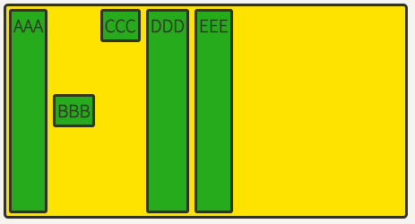
align-self
align-items는 전체 아이템을 정렬, align-self는 개별 item을 정렬
align-self는 align-items보다 우선권이 있다
<!DOCTYPE html>
<html>
<head>
	<meta charset="UTF-8">
	<meta name="viewport" content="width=device-width, initial-scale=1.0">
	<meta http-equiv="X-UA-Compatible" content="ie=edge">
	<title>CSS Flex</title>
	<link rel="stylesheet" href="default.css">
	<style>
		.flex-container {
			display: flex;
			height: 100vh;
			align-items: center;
		}
		.flex-item:nth-child(2) {
			/* align-self: auto; */
			/* align-self: stretch; */
			align-self: flex-start;
			/* align-self: flex-end; */
			/* align-self: center; */
			/* align-self: baseline; */
		}
	</style>
</head>
<body>
	<div class="flex-container">
		<div class="flex-item">AAAAAAAAAA</div>
		<div class="flex-item">BB</div>
		<div class="flex-item">CCCCCC</div>
	</div>
</body>
</html>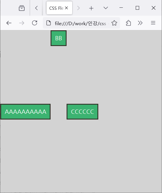
order
아이템의 시각적 나열 순서를 결정
시각적으로 바뀔 뿐, html구조가 바뀌진 않는다
ex) 시각 장애인 분들이 스크린리더를 통해 읽으면 의미가 없어진다
.item:nth-child(1) { order: 3; } /* A */
.item:nth-child(2) { order: 1; } /* B */
.item:nth-child(3) { order: 2; } /* C */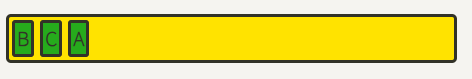
z-index
z-index로 Z축 정렬을 할 수 있어요. 숫자가 클 수록 위로 올라옵니다.
(position에서의 z-index랑 똑같이 생각하시면 됩니다.)
.item:nth-child(2) {
	z-index: 1;
	transform: scale(2);
}
/* z-index를 설정 안하면 0이므로, 1만 설정해도 나머지 아이템을 보다 위로 올라온다 */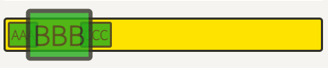
'코딩 > CSS Flex와 Grid 제대로 익히기' 카테고리의 다른 글
| Grid 핵심정리 #1 - 용어 정리 (0) | 2024.10.16 |
|---|---|
| Grid 시작하기 (0) | 2024.10.16 |
| Flex 핵심정리 #7 - 유용한 기법들 (0) | 2024.10.15 |
| Flex 핵심정리 #6 - 반응형 컬럼 (0) | 2024.10.15 |
| Flex 핵심정리 #5 - Flex 속성 활용 (0) | 2024.10.15 |
'코딩/CSS Flex와 Grid 제대로 익히기' Related Articles
more


